Should Your Door and Trim Match? What Designers Are Actually Doing
Never miss an update — choose StructuraLiving as your preferred source on Google.
How it works: Tap the button below to open Google’s settings page, then check the box next to StructuraLiving.
Tap the checkbox to turn it blue — that’s how you know it’s set.
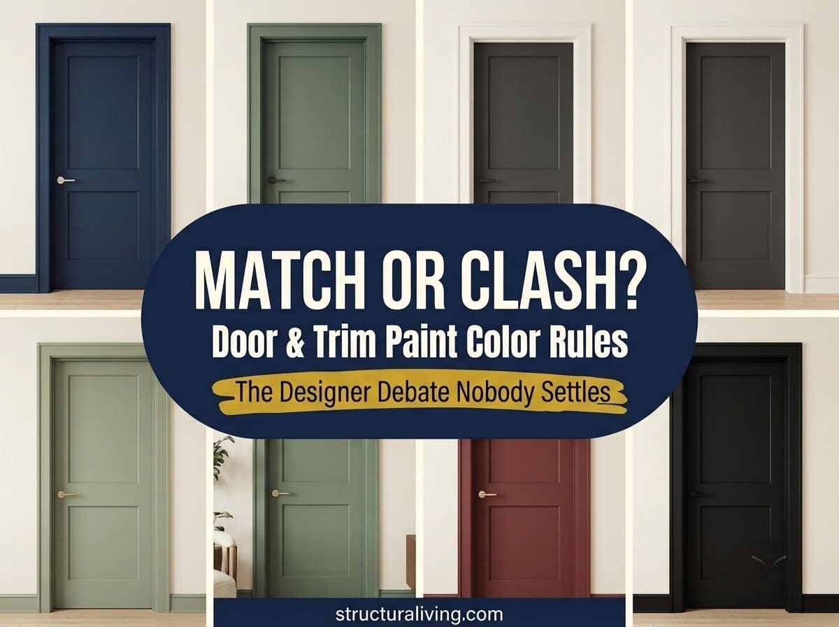
For years, the rule was simple: paint the trim white, paint the door white, and don’t think about it again. That default is gone. Doors are now treated as real design decisions, not afterthoughts that happen to match whatever the trim already is.
But that freedom raises a genuine question with no single right answer. Should the door match the trim, or contrast with it? We asked two designers who land on opposite sides, and looked at the practical paint question nobody seems to cover: what sheen actually holds up on a surface everyone touches all day.
Why Designers Are Rethinking Door and Trim Color in 2026
Interior doors used to be an afterthought, painted to disappear into the trim around them. That’s shifting. Homeowners are increasingly using door color to shape mood, highlight architectural details, or create a clear sense of flow from one room to the next.
Part of this is the rise of color drenching, where walls, trim, ceiling, and sometimes cabinetry all get painted the same saturated hue. Part of it is simpler: people are noticing that a plain white door in an otherwise colorful room can look like an unfinished detail.
Either way, the question of whether the door should match its trim isn’t a minor finishing touch anymore. It’s a real design call.



The Case for Matching Your Door and Trim
Lauren Saab, founder of Saab Studios in Dallas, makes the case for keeping door and trim the same color. She describes the effect as creating “a quiet envelope that feels intentional and calm.”
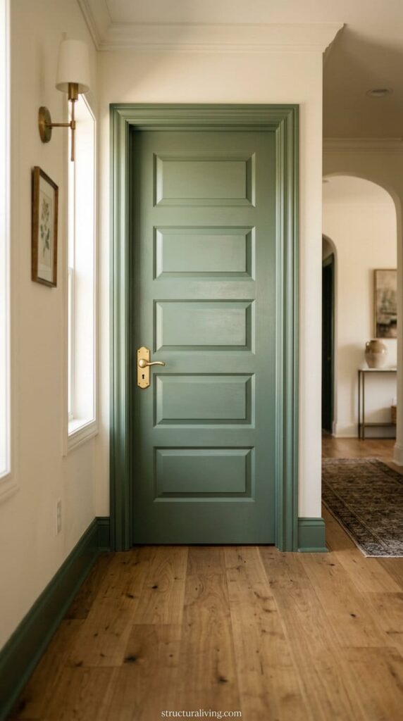
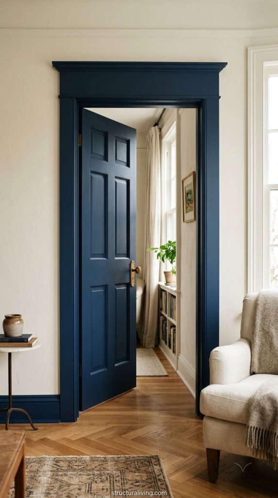
That doesn’t mean boring. A matched door and trim can still carry a bold, saturated color, deep navy or sage green drenched across the whole opening, and the effect reads as considered rather than accidental. Saab’s point is that matching works best “when the goal is quiet cohesion and the architecture can hold its own” without needing a contrasting frame to call attention to it.
This approach tends to work especially well on simpler trim profiles, flat or lightly detailed casing without much dimensional carving. When there’s not much shadow line or relief to the molding itself, a matching color lets the opening read as one clean plane instead of drawing attention to trim that isn’t doing much visual work. It’s also the more forgiving choice in a room with a lot of other things going on, patterned wallpaper, art, layered textiles, since the door and trim recede rather than compete for attention.
There’s a practical upside too. Painting door and trim the same color means one product, one sheen, and no cut line to keep perfectly straight where two colors meet. For a DIYer, that’s a real time savings.
A hired painter will also typically charge less for a single-color room than for a room that needs careful masking between two finishes, since labor on a repaint job is driven largely by masking and cutting-in time, not the paint itself.
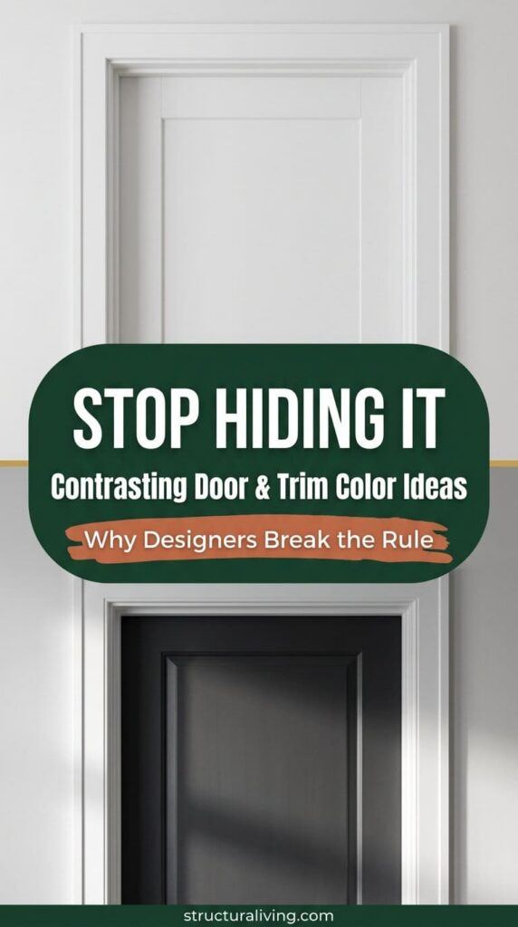
The Case for Contrasting Door and Trim
Peggy Haddad of Peggy Haddad Interiors in Denver argues the opposite. In her view, sameness can flatten a room. “When everything fades into the same shade, a room can start to feel flat,” she says, and contrast “is where the magic happens.”
Her reasoning centers on architecture. Darker trim against a lighter door, or the reverse, can sharpen details that would otherwise disappear. A painted door in a hallway, distinct from the trim around it, can pull the eye through the space instead of letting the whole wall read as one flat plane.
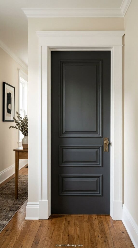
Contrast makes the most sense when there’s real trim detail worth showing off, deep casing, panel molding, a genuinely architectural doorway, or when a single door is meant to function as a statement: matte black or navy against a lighter, quieter trim color. Older homes with original deep-set casing or picture-frame wainscoting benefit the most from this treatment, since the extra shadow and dimension already built into the millwork is exactly what contrast is designed to highlight. A newer home with flat, builder-grade trim has less to gain from the contrast, since there’s less actual architecture for the color break to reveal.

A hard-curing, chip-resistant enamel built for trim and doors, the same durability logic Benjamin Moore's guidance points to, available in multiple sheens and colors
Shop NowThis post contains affiliate links. We may earn a commission on qualifying purchases at no extra cost to you.
The tradeoff is mostly labor. Two colors meeting at a clean line takes more masking time and more care, whether you’re doing it yourself or paying someone to.
The seam itself is unforgiving. A slightly wavy cut line reads as sloppy in a way that’s far less noticeable when the whole opening is one color, so this is the approach where a steady hand, or a well-applied painter’s tape line, actually matters.
Which Approach Actually Fits Your Room?
| Matching Door & Trim | Contrasting Door & Trim | |
|---|---|---|
| Best for | Simple trim with little architectural detail, or a room going for calm cohesion | Real trim detail worth highlighting, or a bold statement door |
| Skill level | Easier for a first-time DIYer, one color, no cut line | Requires careful masking and a steady hand at the seam |
| Cost to execute | Generally lower, one product and one sheen | Slightly higher, extra prep time and often two products |
| Risk if done wrong | Can read as flat in a room with little else going on | A sloppy cut line is much more visible than a matching one |
Neither approach is objectively better. A room with genuinely nice trim detail is wasted if it’s painted to disappear. A room without much architectural interest can look more finished, not less, when door and trim recede into one calm color together.
The Paint Sheen Question Nobody Talks About
Almost every article about door and trim color skips a detail that matters more than the color itself: doors and trim need a harder, more washable finish than walls, regardless of whether you match or contrast them.
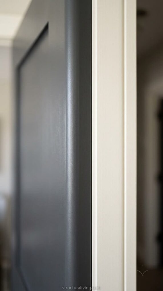
Doors and trim are among the most touched surfaces in a home. Hands, bags, kids, pets, and furniture brush against them constantly, in a way walls rarely experience. According to Benjamin Moore’s official guidance, a satin to semi-gloss sheen is the standard recommendation for trim and doors, since it resists moisture, scuffs, and everyday wear far better than the flatter finishes typically used on walls.
Trim-specific enamels, built to cure harder than standard wall paint, also resist denting and oil transfer from hands, which matters most right at doorknob height, where ordinary wall paint eventually shows wear. This holds true whichever color strategy you choose. A matched door and trim in the wrong sheen will show scuffs just as fast as a contrasting one, and repainting a high-touch surface every year gets old fast.
How to Actually Paint It: The Process That Holds Up
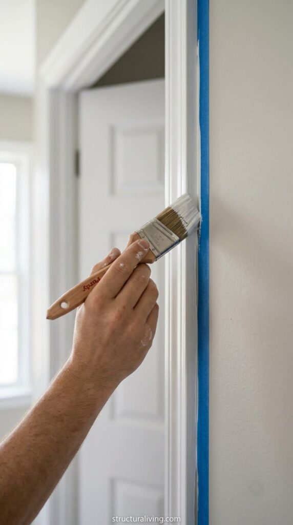
Color and sheen decisions only matter if the paint job itself holds up, and this is the part most inspiration content skips entirely. Benjamin Moore’s official trim-painting guidance breaks the process into four real steps, and skipping any of them is usually why a repaint looks fine for a month and rough by year two.
Gather the right supplies first. Caulk, a primer made for trim and doors, your chosen paint, an angled brush, painter’s tape, a sanding block, and a damp sponge. A high-hiding, all-purpose primer is the standard recommendation here, not a generic wall primer, since it’s formulated to lay down smoothly on wood and dry to a surface that sands easily.
Inspect and repair before anything else touches the trim. Fill gaps where trim meets the wall with caulk, and let it fully cure before moving on. Skipping this step is one of the most common reasons a “fresh” paint job still looks tired, the color is new but the gaps and cracks underneath are exactly the same.
Prep the surface properly. If the existing finish is glossy, a light sanding first gives the new paint something to grip instead of sliding off in a few years. Wipe everything down with a damp sponge afterward to clear dust, then tape off the wall or the trim, whichever side you’re protecting, and prime any repaired spots so they don’t flash through the topcoat.
Paint in the right order, top to bottom. Crown molding first, then window frames, then door frames, and baseboards last. This isn’t arbitrary, working top to bottom means any drips land on trim you haven’t finished yet instead of trim you just painted.
Let each coat dry completely before the next, and check your specific product’s label for its actual recoat window since this varies by formula, a fast-drying latex trim enamel and a traditional oil-based one behave very differently.
2026 Color Pairings Worth Trying
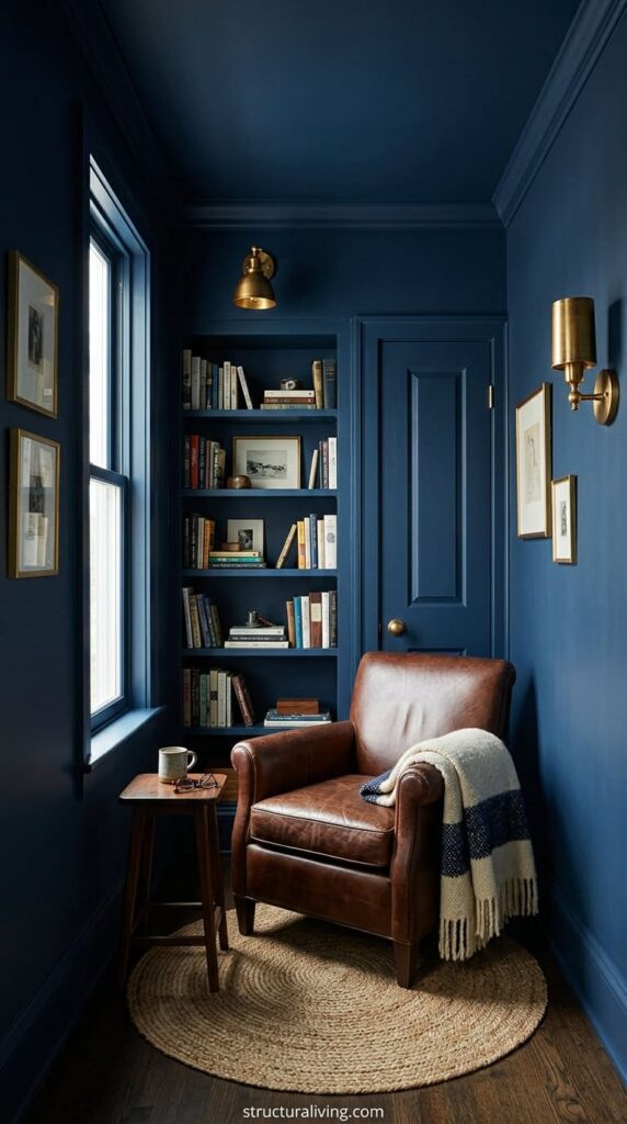
Deep navy, drenched. Door, trim, and walls all in the same saturated navy. Works best in a room with good natural light so the color reads as rich rather than cave-like, and pairs well with warm brass or unlacquered hardware. Cross-reference: this is the color-drenching technique described earlier under “The Case for Matching,” and it’s the pairing where matching pays off most, since a navy contrast seam would visually chop up a small room instead of expanding it.
Sage green, matched. A muted, organic-leaning green that works in both modern and traditional trim profiles. Calmer than navy, and forgiving in rooms with less natural light since it doesn’t absorb as much light as a true dark color. It reads differently depending on the room’s other undertones, warmer and more olive-leaning next to wood tones and brass, cooler and more blue-leaning next to white marble or chrome, so test a sample against your actual fixtures before committing to a full room.
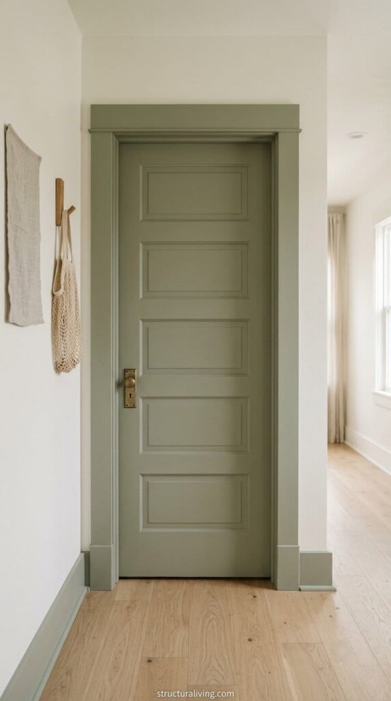
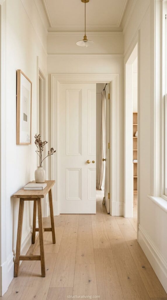
Warm “Cloud White,” matched. A soft, warm white replacing the cooler grays that dominated the last several years. The safest matched option for anyone not ready to commit to a saturated color, but still reads as intentional rather than default builder-grade white. The undertone is the whole point here: a cooler, blue-based white next to warm wood floors or brass hardware can look slightly institutional, while a warm white ties the whole room together.
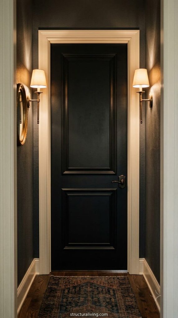
Matte black door, contrasting light trim. A genuine statement move. Works best on a single door, an entry or a powder room, rather than throughout a whole hallway, and needs trim detail worth the contrast to justify the visual weight of a black door. Matte, not glossy, is the deliberate choice here, a high-gloss black shows every fingerprint and dust particle under direct light, while a matte or eggshell-leaning black hides daily wear far better on a door that gets touched constantly.
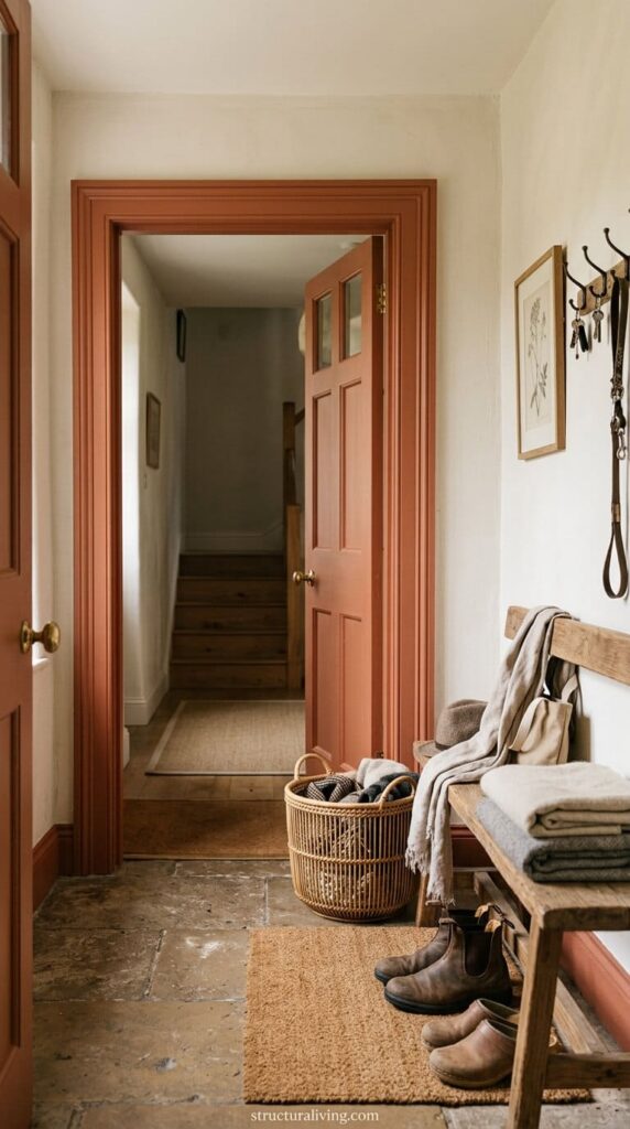
Warm terracotta, matched. An earthier, more grounded alternative to navy for anyone who wants a saturated color without the coolness of blue or black. Reads well against natural wood, linen, and rattan textures, and tends to feel less formal than navy or black, better suited to a mudroom or casual entry than a formal foyer.
Before You Start: Real Talk
A few things worth knowing before you pick up a brush, the kind of detail that only shows up once you’ve actually lived with the choice.
Touch-up paint almost never matches perfectly a year or two later. Paint shifts slightly with age and light exposure, so keep the exact product name and color code, not just a sample chip, somewhere you’ll actually find it again.
Roller marks are the most common DIY mistake on doors specifically, since a door’s flat, close-up surface shows lap marks that a textured wall would hide. Use a high-quality angled brush for the panel edges and a foam roller for the flat sections, working in one direction and maintaining a wet edge.
And a dark, saturated color can make a small hallway or windowless entry feel smaller if there isn’t enough artificial light to compensate. If you’re drawn to navy or black but your entry gets little natural light, plan for stronger overhead or sconce lighting before committing to the color.
Skipping caulk is another quiet mistake. Gaps between trim and wall don’t disappear just because there’s new paint over them, they usually become more visible, since fresh paint catches light differently than the old, slightly dirty gap underneath. Caulking first and letting it cure fully is a five-minute step that’s easy to skip when you’re eager to see the new color on the wall.
Hardware finish matters more than most people expect once the door itself becomes a real design element. A brushed nickel handle on a matte black door, or a plain builder-grade hinge left unpainted next to a freshly painted contrasting trim, can undercut an otherwise good color decision. If you’re investing in a statement color, budget for updated hardware in the same pass rather than treating it as a separate project for later.
FAQ
Does the door have to match the walls too, or just the trim? No. Matching door and trim to each other while keeping the walls a different color is one of the most common approaches, and it still reads as intentional. Full color drenching, where walls, trim, and door are all one color, is a separate, bolder choice, not a requirement.
What sheen should I use on interior doors and trim? Satin to semi-gloss, ideally a trim-specific enamel rather than standard wall paint, per Benjamin Moore’s guidance above. It holds up better to the constant touching doors and trim get.
Is it more expensive to hire a painter for contrasting colors? Usually, yes, though the difference is modest. The extra cost comes from masking time at the seam between two colors, not the paint itself.
Can I mix matching and contrasting in the same house? Yes, and many designers do exactly this: matched door and trim in most rooms for cohesion, with one or two contrasting statement doors, like an entry or powder room, treated as a moment.
Do I need to prime before repainting a door that’s already painted? Usually yes if you’re changing colors dramatically, going from a light color to a dark one, or from an oil-based finish to latex. Priming gives the new color true coverage and helps the topcoat adhere properly, especially over a glossy existing finish that’s been lightly sanded first.
How long before I can hang a freshly painted door back on its hinges? Let each coat dry completely before handling, and check your specific paint’s label for guidance since dry time varies by product and by humidity. Even once it feels dry to the touch, treat the finish gently for the first couple of weeks, avoid heavy scrubbing or aggressive cleaning until it’s fully cured.
Related Posts
- 20 Stunning Mid Century Modern Front Door Designs to Inspire Your Home
- 15 Stunning Colors for a Mid Century Modern Palette
- 20 Stunning Color Palettes for a Mediterranean-Style Home
Products We Recommend
This post contains affiliate links. We may earn a commission on qualifying purchases at no extra cost to you.
Rust-Oleum Painter's Touch Multi-Surface Enamel Paint, Gloss/Semi-Gloss (Quart)
A hard-curing, chip-resistant enamel built for trim and doors, the same durability logic Benjamin Moore's guidance points to, available in multiple sheens and colors
Shop Now
Purdy 2-1/2" Angle Sash Paint Brush, Nylon/Polyester Bristle
The angled brush shape needed to cut a clean line at a door panel edge or a contrasting trim seam without lap marks.
Shop now
FrogTape Multi-Surface Painter's Tape with PaintBlock
Sharp-line painter's tape for masking a contrasting trim seam cleanly, referenced in the contrast-color section above.
Shop nowNever miss an update — choose StructuraLiving as your preferred source on Google.
How it works: Tap the button below to open Google's settings page, then check the box next to StructuraLiving.
Tap the checkbox to turn it blue — that's how you know it's set.